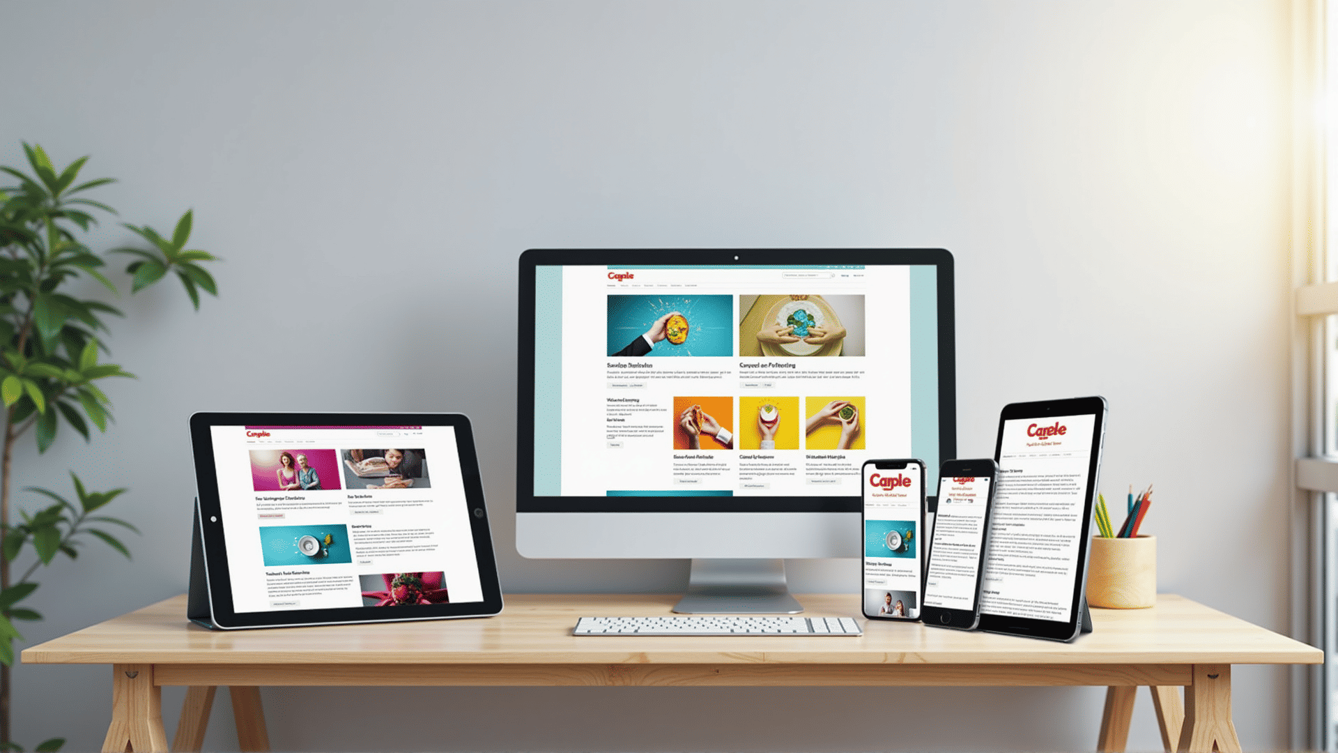
Creating websites that offer an optimal viewing experience across a plethora of devices is crucial in today's digital landscape. The concept of making sites flexible to fit various screen sizes and resolutions is known as adaptive layout design. This approach ensures your site remains accessible and visually appealing whether viewed on a smartphone, tablet, or desktop computer.
Understanding the Basics
The essence of this design technique lies in its ability to adjust and respond to the user's device environment. This involves using fluid grids, flexible images, and media queries. Fluid grids are designed to resize elements proportionally instead of using fixed pixel values, making layouts more elastic. Meanwhile, media queries allow developers to apply different styles based on specific conditions like screen width, height, and orientation.
Advantages of Adaptive Layouts
-
Enhanced User Experience: By improving usability, individuals navigate sites with more ease. This seamless transition from one device to another helps in retaining audience engagement and satisfaction.
-
Improved SEO: Search engines favor sites with a strong mobile presence, which can potentially lead to improved rankings. Ensuring your site is compatible with all device types enhances its visibility on search platforms.
-
Cost Efficiency: Employing this technique negates the necessity for multiple site versions for different devices. One design fits all, saving resources and time.
-
Increased Reach: With various devices in use today, optimizing your site to be device-friendly ensures that your content reaches a wider audience.
Implementing a Strategy
Begin by analyzing your audience's habits. Understand what devices they predominantly use, and tailor your design strategy accordingly. It's essential to prioritize the content and functionalities that matter most to users.
Next, incorporate flexible images and media queries. These components are vital as they allow images to resize or change according to the device's characteristics without compromising quality. Media queries enable the customization of styles that can be adjusted based on device features.
Testing and Evaluation
Continuous testing is a cornerstone of successful site design. Utilize tools that simulate various device environments, evaluating how your site performs. This can highlight potential issues, allowing you to tweak your design for an even better user experience.
Additionally, seeking feedback from actual users is invaluable. Understanding their interaction with your site can provide insights that automated tools may miss.
Conclusion
Adapting your site to the diverse range of devices available today is not just a trend; it’s a necessity. It provides a broader reach and ensures that all users have a positive interaction with your digital content. By leveraging the basics of flexible layouts, from media queries to fluid grids, you can create an interface that is not only effective but enhances the overall user journey. This forward-thinking approach is crucial for maintaining relevance and connection in an ever-evolving digital world.
