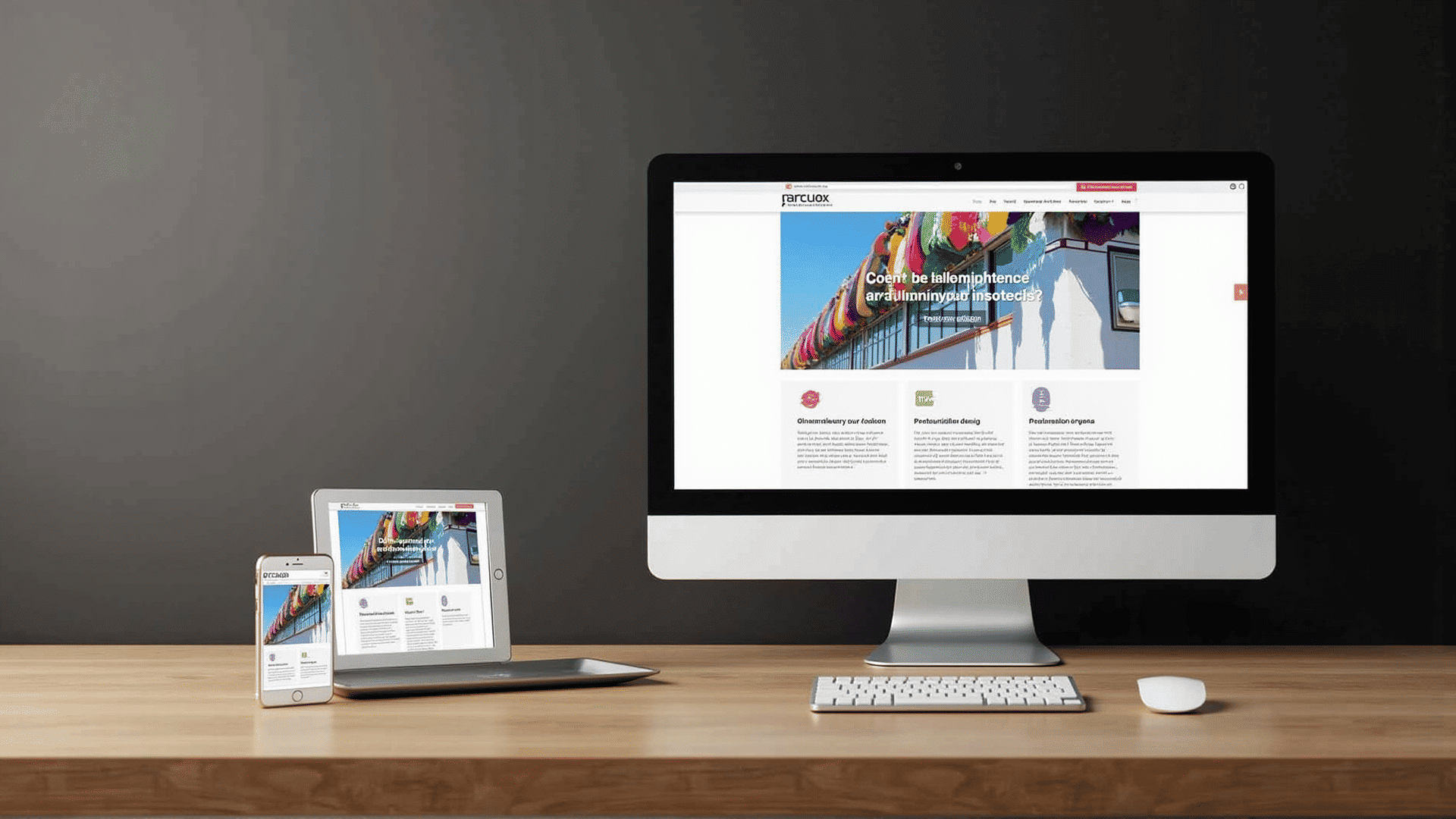
Creating a flexible and adaptable online presence is more important than ever. Ensuring that a site looks and functions well on various devices can significantly enhance user experience and engagement. Let's dive into some effective techniques for achieving such flexibility.
Fluid Grids
One foundational technique involves using fluid grids. Unlike fixed layouts, fluid grids allow for each element to scale in relation to the screen size. This is typically achieved by using relative units, such as percentages, instead of absolute units like pixels. By designing with a fluid grid, you create a layout that seamlessly adjusts to different screen sizes, providing a consistent experience across devices.
Flexible Media
Alongside fluid grids, making media elements flexible ensures your visuals contribute to a responsive design. This involves setting media elements, such as images and videos, to scale within their containing elements. A common approach is to employ the CSS max-width: 100% rule to ensure that images never exceed the width of their containers. This approach preserves the aspect ratio while allowing flexibility in different layouts.
Media Queries
Media queries are essential in creating adaptability for different screen sizes and resolutions. They allow specific styles to be applied based on conditions like viewport width and height. By utilizing media queries, you can tailor the appearance of your site to ensure optimal readability and usability on diverse devices. This technique can manage everything from font sizes to complex layout adjustments, ensuring a cohesive experience.
Mobile-First Design
A mobile-first approach is another powerful strategy. This technique involves designing for the smallest screen sizes first before scaling up. By prioritizing mobile experience, you ensure that essential content and functionality are accessible on smaller devices and then progressively enhance the design for larger screens. This method is crucial for accommodating the steadily increasing number of users accessing sites on mobile devices.
Responsive Typography
Typography plays a significant role in readability and should also be flexible. Responsive typography ensures text is legible and aesthetically pleasing on various devices, using techniques like fluid typography that adjusts font size based on screen width. Tools like vw (viewport width) units allow for dynamic scaling of text, maintaining readability across different contexts.
Advanced Frameworks and Tools
To facilitate the creation of responsive designs, utilizing frameworks and tools can be incredibly beneficial. Frameworks provide pre-built responsive grid systems and components, allowing for rapid development while ensuring consistency. These frameworks are usually accompanied by extensive documentation, making it easier to implement responsive design principles.
Testing and Iteration
Finally, regular testing on various devices is crucial. This practice not only uncovers issues that may not be apparent in a development environment but also allows for continuous improvement of the user interface. Responsiveness should be an ongoing process, with refinements made as new devices and technologies emerge.
Incorporating these techniques can lead to a website that not only meets the aesthetic and functional requirements of its diverse audience but also provides a seamless and engaging user experience. As technology and user behaviors continue to evolve, maintaining a responsive design approach is key to staying ahead in the digital landscape.
